Even the most ardent colour fan can find it tricky to use a palette of strong shades in their home. This was precisely what Emma Green, interior designer in London, discovered when she was asked to refurbish and remodel two floors of this spacious Victorian terrace. ‘The clients knew they wanted a contemporary style with colour,’ explains Green. ‘They love colour, and have a vast collection of brightly coloured artwork, but they were afraid to use it.’
Now, after almost four months of work, bland interiors are a thing of the past. The kitchen has become a contemporary, sophisticated grey and white scheme, offset with spirited splashes of vibrant lime green. And a bold burst of colour winds its way throughout almost every room in the home.
Who lives here A couple and their two young sons and daughter
Location Battersea, London
Property A three-storey end-of-terrace Victorian townhouse
Size 4 bedrooms, 2 bathrooms
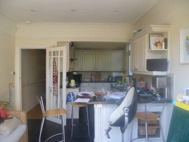
Designer Emma Green Design‘The client was pregnant with her second child at the time, and the baby arrived about a week after completion,’ says designer Emma Green, ‘so we had a very tight and very real deadline.’Pictured above is the kitchen as it was before work began.
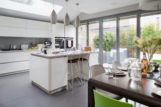
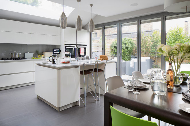
The ground-floor kitchen was extended into the side return, which provided an extra 1.5m of space. Large roof lights and bifold doors opening onto the garden now flood the space with light.
‘The clients wanted off-white, glossy, handleless units for a sleek look,’ says Green. ‘The edges are curved and so very child-friendly, while the large-format floor tiles (600mm x 600mm) make the space feel even larger and create a seamless look,’ she adds.
Schuller kitchen, KitchenKoncepts. Floor tiles, Surface Tiles.
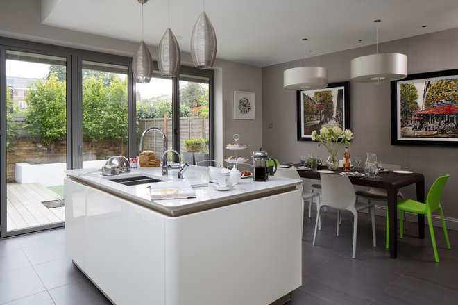
‘The clients love to entertain and often have extended family staying, with visitors of all ages,’ says Green, ‘so the open-plan kitchen-diner is in constant use.’
A trio of chrome pendant lights over the island unit help illuminate the sink area, which also includes a dishwasher, recycling bin and a boiling-water tap. ‘The Quooker tap is one of my clients’ favourite things,’ says Green.
Back wall painted in French Grey, Little Greene. Worktop, Corian. Boiling-water tap, Quooker.
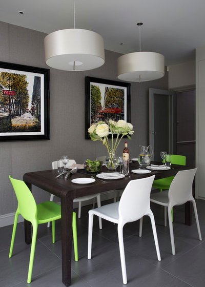
‘As this section of the room is also used in the evenings for adults, it was important to add a touch of luxury here,’ says Green. ‘Silk pendant lights over the dining table add texture, glamour and a little softness. A taupe-coloured vinyl wallpaper offers a neutral yet hard-wearing backdrop and adds an extra layer of texture and depth to the feature wall.
‘The wenge table is extendable, making it flexible for the clients’ day-to-day needs, and to cater for larger family gatherings,’ the designer adds. ‘And colour is added with lime green chairs and vibrant artwork.’
Wallpaper, Vescom. Exteso table, Pedrali. Polo pendant lights, CTO Lighting. Framed photographs, Nigel Cooke.
Discover what the experts have to say on the future of the feature wall
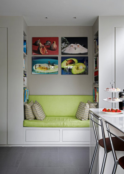
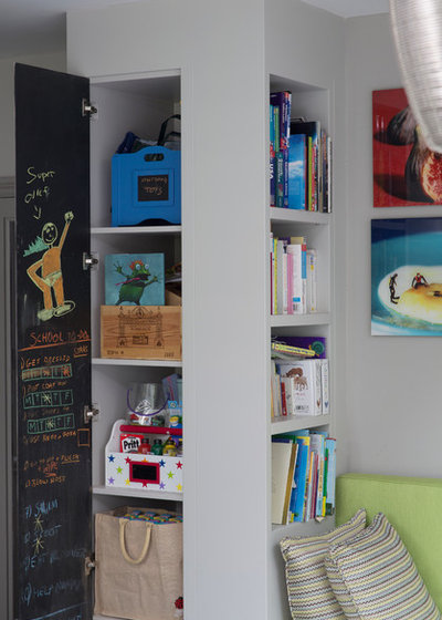
‘I created a bespoke reading nook in this corner of the kitchen,’ says Green. ‘It’s the main feature between the door to the hallway on one side, and the door to the living room on the other,’ she adds. ‘It provides masses of storage for the children’s toys and books, with open shelves, concealed cupboards and pull-out drawers underneath. The seating is upholstered in hard-wearing lime green linen, which is good for the kitchen and the children!’
Merati fabric in Lime, Designers Guild. Artwork, Willy Rojo.
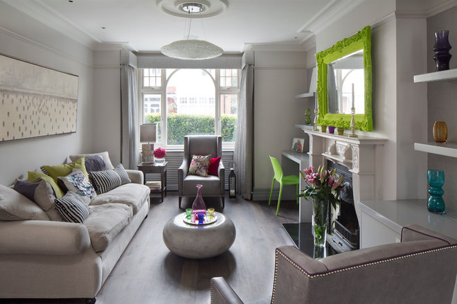
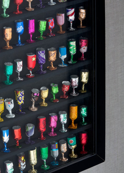
The ground floor reception room is painted in a sophisticated grey shade to let the vibrant flocked lime green mirror, colourful glassware and artwork stand out.
‘One of the greatest challenges of the project was persuading the clients to paint their woodwork darker than the walls,’ says Green. ‘I was called over urgently one Saturday morning to reassure them to stick with it until the room was finished so they could see how it all worked together. They ended up loving it,’ she adds.
The original Victorian wooden flooring was sanded and stained a bespoke taupe/grey shade to complement the scheme. A cream linen sofa is offset with grey leather chairs with nickel studs and a circular concrete coffee table to make the room feel both smart and luxurious.
The punchy lime green flocked mirror is brave and beautiful all at once and adds personality and spirit to the space. ‘The clients particularly liked lime green and already had some cushions in this colour,’ explains Green. ‘I set the mirror against the grey background to make it really stand out.’
Flocked mirror, Thomas & Vines. Walls painted in Cornforth White and Pavilion Gray, both Farrow & Ball. Chairs, The Sofa & Chair Company.
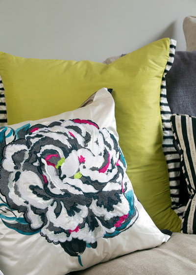
The plain sofa is livened up with a pile of mismatched cushions that combine vibrant blocks of colour, overblown floral prints and smart stripes for a dramatic edge.
Cushions, Designers Guild.
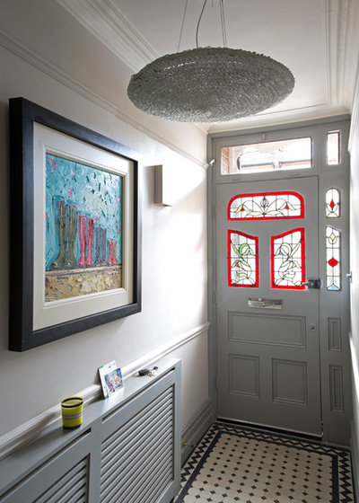
The hallway introduces the overall design concept of the interior – grey tones mixed with vibrant artwork and original fixtures.
‘Internal front doors often get neglected, so we painted this one to match the rest of the hallway,’ explains the designer. ‘The bespoke radiator cabinet was my design. I wanted something contemporary and linear to tie in with the rest of the cabinetry.’
Flooring, original Victorian tiles. Walls painted in Pavilion Gray,Farrow & Ball.
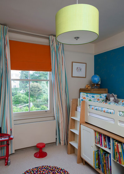
A colourful, contemporary boy’s bedroom comes to life with a rainbow-coloured rug and vibrant window treatments.
‘He loves dinosaurs, but we didn’t want the bedroom to be too themed,’ says Green. ‘We used a wallpaper with silver dinosaurs sketched onto it, which adds colour to the room but will grow with him and stand the test of time.’
Archie cabin bed, Feather & Black. Hay Pinocchio rug, Nest. Blind in Linara in Clementine, Romo. Curtains and wallpaper, Harlequin.
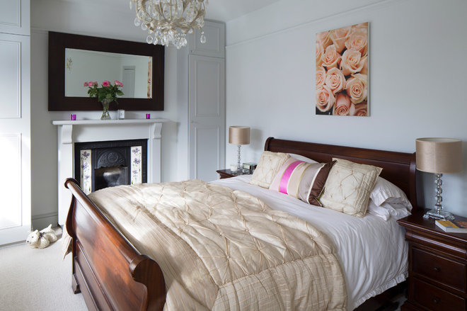
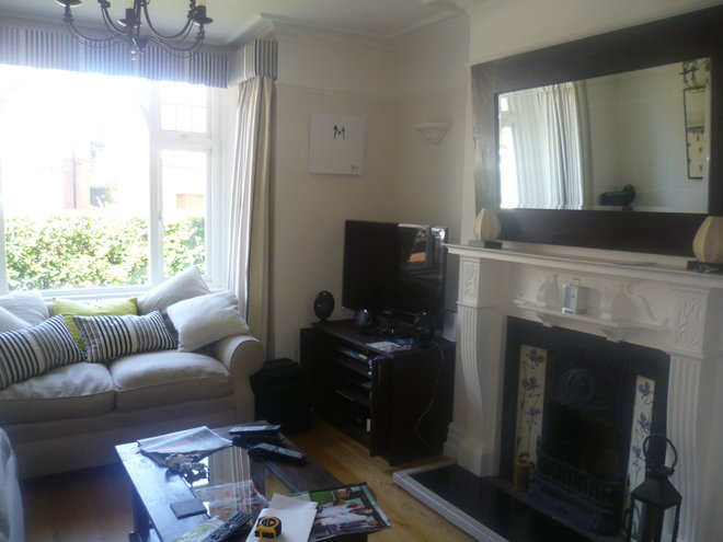
The guest room needed an update, so Green had it painted in soft grey and relocated the mirror from the living room to hang here above the fireplace.
‘The roses artwork is a close-up of my client’s wedding bouquet,’ the designer explains. ‘We wanted a prominent place for this treasured piece in the scheme.’
Walls painted in Pearl, Little Greene.
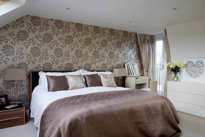
The huge bed is the star of the luxurious master bedroom, which is part of a loft conversion. This had already been completed when the owners moved in, so not much needed to be changed.
Bed by The London Bed Company at Selfridges. Wallpaper, Designers Guild.
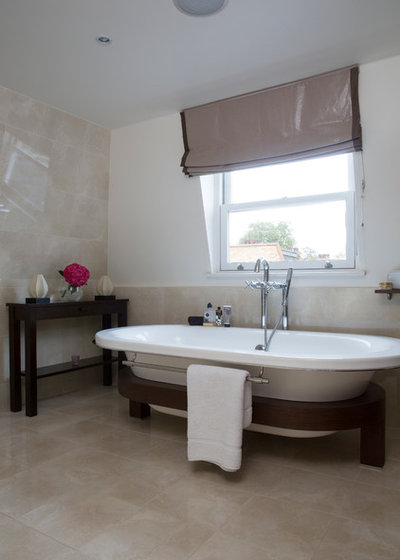
The top-floor master bathroom is used by the grown-ups of the house. It offers a calm, laid-back space that’s perfect for relaxing and winding down.
Fixtures and fittings, Porcelanosa.


